Visualizations using Matplotlib & Seaborn: Pymaceuticals
- Sarah E. Stegall-Rodriguez

- May 2, 2023
- 3 min read
Updated: Jul 6, 2023

I had the opportunity to apply my knowledge of Pandas, Matplotlib, and Seaborn to a real-world scenario and dataset. As a senior data analyst at Pymaceuticals, Inc., a pharmaceutical company specializing in anti-cancer medications, I worked on a study focused on potential treatments for squamous cell carcinoma (SCC), a prevalent type of skin cancer. In this study, we analyzed data from 249 mice with SCC tumors who received various drug regimens. Over a period of 45 days, we observed and measured tumor development. The main objective was to compare the performance of Pymaceuticals' drug of interest, Capomulin, with other treatment regimens.
Data Preparation
To begin, I imported the necessary package dependencies and data files. The study involved merging the "mouse_metadata" and "study_results" DataFrames into a single comprehensive DataFrame. This step allowed us to have a consolidated view of the data. Additionally, I verified the number of unique mice IDs to ensure data integrity. Furthermore, I conducted checks for duplicate time points associated with mouse IDs. Based on this verification, I created a cleaned DataFrame by removing any duplicate data. This ensured that our subsequent analysis was based on accurate and reliable information.

Summary Statistics
In order to provide a comprehensive overview of the data, I generated a DataFrame containing summary statistics for each drug regimen. The statistics included the mean, median, variance, standard deviation, and SEM of the tumor volume. This analysis allowed us to gain insights into the central tendency, variability, and distribution of tumor volumes across different treatment regimens.

Bar Charts and Pie Charts
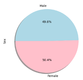
Visual representation of data plays a vital role in conveying information effectively. To this end, I created bar charts to illustrate the total number of rows (Mouse ID/Timepoints) for each drug regimen throughout the study. I utilized both the Pandas DataFrame.plot() method and Matplotlib's pyplot methods to generate the bar charts. In addition, I created pie charts to depict the distribution of female and male mice in the study. These charts provided a clear visualization of gender proportions within the research sample.


Quartiles, Outliers, and Box Plot
Identifying outliers and understanding the spread of data were meaningful to understand the distribution of the data. To achieve this, I calculated the final tumor volume for each mouse across four promising treatment regimens: Capomulin, Ramicane, Infubinol, and Ceftamin. By determining the quartiles and interquartile range (IQR), I was able to identify potential outliers within these treatment groups. Next, I created a grouped DataFrame that displayed the last (greatest) time point for each mouse and merged it with the original cleaned DataFrame. This enabled a more focused examination of tumor volume data. I then generated a box plot using Seaborn to visualize the distribution of the final tumor volume for each treatment group. The box plot effectively highlighted any potential outliers, providing valuable insights into the spread and distribution of the data.

Line Plot and Scatter Plot
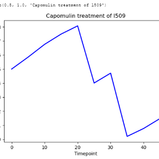
In order to explore specific trends within the dataset, I created a line plot that showcased the tumor volume over time for a single mouse treated with Capomulin. This visualization allowed us to observe the changes in tumor volume over the course of treatment. Additionally, I generated a scatter plot that illustrated the relationship between mouse weight and the average observed tumor volume for the entire Capomulin treatment regimen. By analyzing this scatter plot, we were able to identify any potential correlations or patterns between weight and tumor volume.


Correlation and Regression
To further investigate the relationship between mouse weight and tumor volume, I calculated the correlation coefficient and implemented a linear regression model. This analysis helped quantify the strength and direction of the relationship, providing insights into how weight may impact tumor volume. I then plotted the linear regression model on top of the scatter plot created using Seaborn, enhancing our understanding of the relationship between these variables.

Conclusion
This project allowed me to leverage Python, Matplotlib, and Seaborn to analyze and visualize the dataset effectively. By preparing the data, generating summary statistics, creating bar and pie charts, identifying outliers through quartiles, constructing box plots, and exploring correlations and regression models, I was able to gain valuable insights into the potential treatments. These skills are essential for effective data analysis and reporting, enabling evidence-based decision-making.
For a detailed analysis and access to the complete project, please visit my GitHub. This project was completed as a part of UTSA's Data Analysis and Visualization Certification.


Comments